BRERETON BAILEY
BRERETON BAILEY SOLUTIONS
Case Study
PROJECT BRIEF
Create a new logo identity targeted at the hospitality recruitment industry to help Brereton Bailey Solutions stand out in the marketplace.
PROJECT OUTCOMES
Design Farm helped Brereton Bailey focus their branding identity to increase the visual impact their marketing material has to prospective clients.
SCOPE OF PROJECT
Logo Identity Design
Business Cards, Letterheads, Compliment Slips
Printed Marketing Brochure
Digital Marketing Brochure
Social Media Branding
THE NEW LOGO
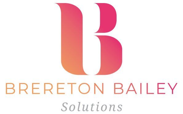
The logo is comprised of a combination of the first letter of the surnames of the company founders (Marisa Bailey & Kimberley Brereton) . These letters were worked into creating an iconic monogram 'B' which if you look closely is a clever combination of a lower case 'b' and an upper case 'B' symbolising the partnership and strength that the pair bring to their business.
BRAND COLOURS
Bold, diverse and fun. The Brereton Bailey Solutions brand colour gradient is a reflection of the complimentary blend of the two personalities within the business.
TYPOGRAPHY
We chose two different typefaces to support the logo identity of the brand to give a modern, clean feel with just enough character. The typefaces are both flexible enough to work well in large print right down to small digital screens. We gave the typefaces a generous amount of kerning to let the letters breathe. The business name is formatted in an all upper case typeface with the supporting business strap-line in an elegant serif typeface.


